Penta Pharma
Optirex packaging design

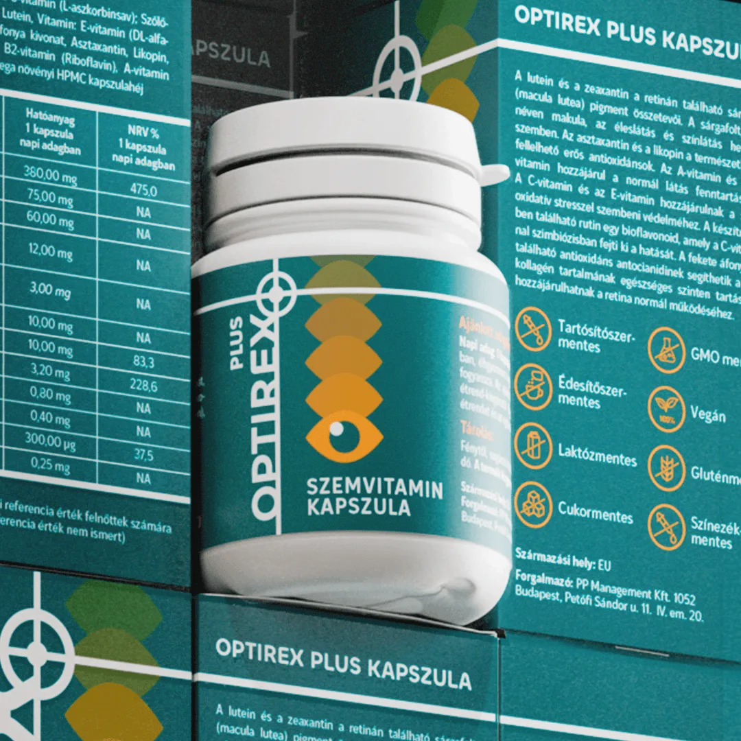
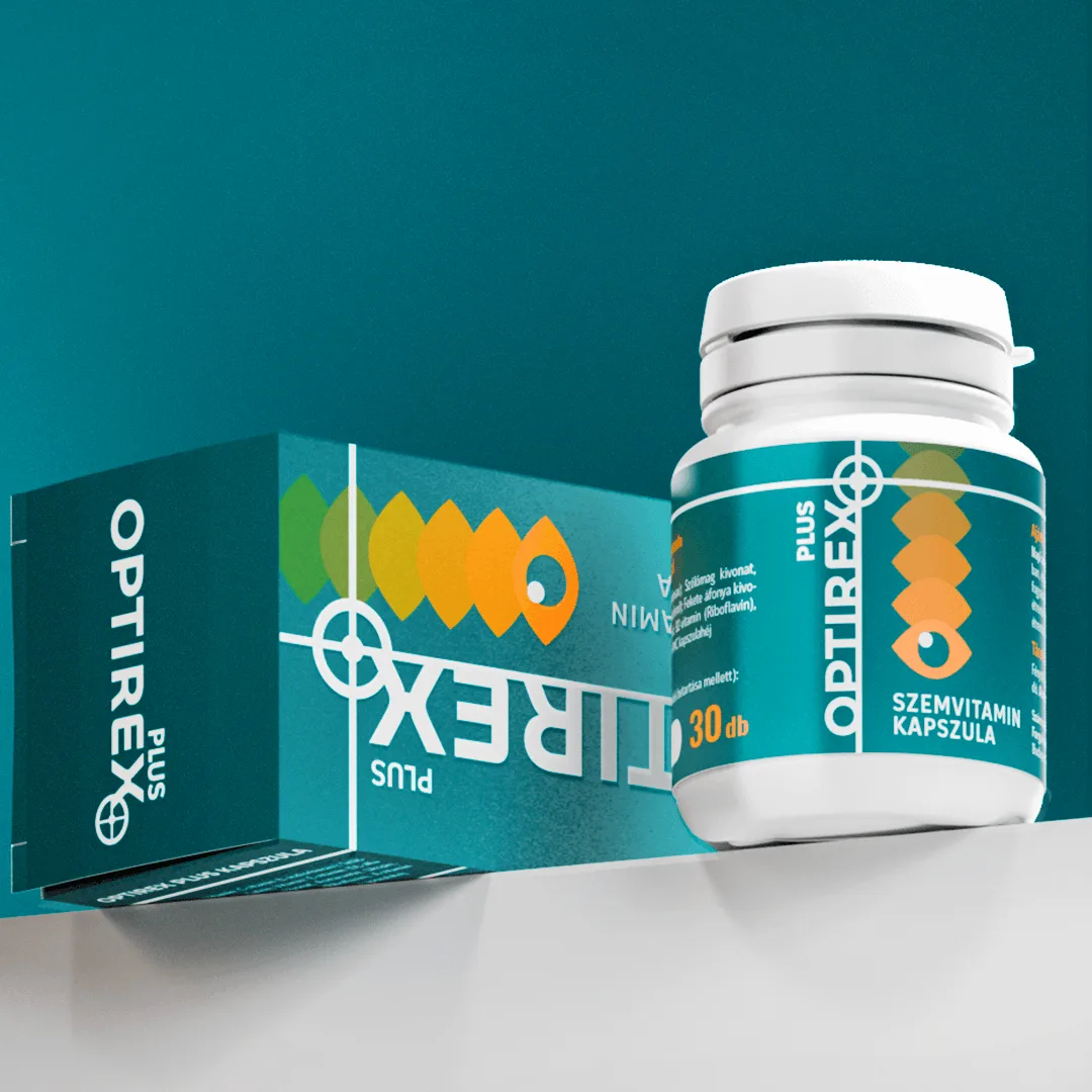
We worked on revamping the packaging and visual identity of the Optirex Plus eye vitamin range for Penta Pharma. The aim was to create a modern, instantly recognisable branding and packaging design system which can attract attention in a pharmacy setting immediately.

In case of Optirex Plus, the packaging functions not merely as an aesthetic surface, but as one of the brand’s most important communication tools. Progressive’s task was to make the product range’s visual appearance more innovative, more distinctive and easily identifiable even in the open-shelf pharmacy environment.

Services: Branding
Industry: Healthcare and pharmaceuticals
Client: Penta Pharma
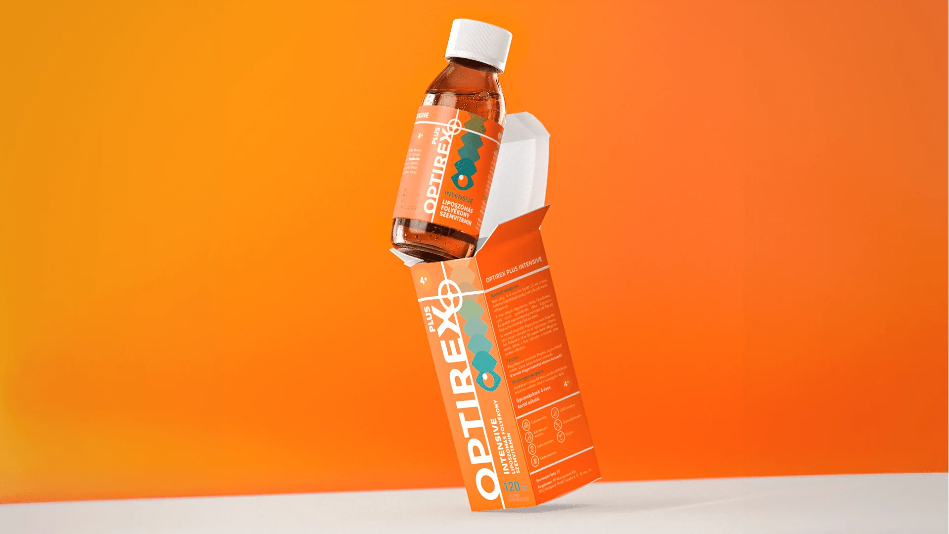
Optirex Plus eye vitamin packaging design – product box and bottled pharmacy format with a distinctive orange visual

The challenge

The interior layout of pharmacies has undergone a quiet transformation in recent years. More and more are switching to an open-shelf layout, which means that customers encounter the product packaging first, rather than the pharmacist. In this environment, design is much more than just an aesthetic facade: it becomes a primary sales tool.

Competition for shoppers’ attention is intensifying, as they increasingly seek the visual experience and instant recognisability they are accustomed to in other retail settings, even within pharmacies. This is how packaging that ‘jumps off the shelf’ and is clearly distinctive becomes the first and most important tool for sales.

For the Optirex Plus eye vitamins, Penta Pharma therefore sought a design that deliberately departs from the sterile appearance typical of the category, creating an impression of innovation at first glance and capturing the customer’s attention.
The approach

When Progressive won the tender from Penta Pharma to revamp the entire visual concept for the range of Optirex Plus eye vitamins, this was precisely the market challenge we had to address. The aim was to design a modern, innovative brand identity and packaging that deliberately breaks with the visual clichés of the category and immediately captures the consumer’s attention. This approach is also endorsed by Viktória Tantics, Head of Marketing and Product Development at Penta Pharma: “In case of Optirex Plus, too, packaging is a strategic tool for us, one that begins to build the brand’s credibility right there on the shelf. Progressive’s clean style and graphic ingenuity aligned very well with our vision.”

The core of the visual concept is formed by the synergy between the + sign symbolising focus, the dynamic eye motif referring to vision, and the exciting typographical solutions.

The results

Nothing demonstrates the power of the new brand identity and the success of our collaboration better than the fact that Optirex Plus will soon be launched not only in Hungary but also on European markets and in certain countries in the MENA region. We are proud of the team’s work!

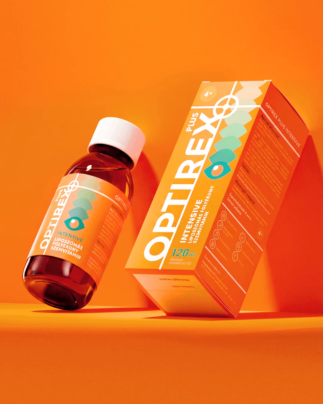
Optirex Plus eye vitamin packaging design – product box and bottled pharmacy formats with a distinctive orange identity

The new packaging for Optirex Plus deliberately breaks away from the sterile category codes, whilst maintaining the professional credibility befitting a pharmacy setting.

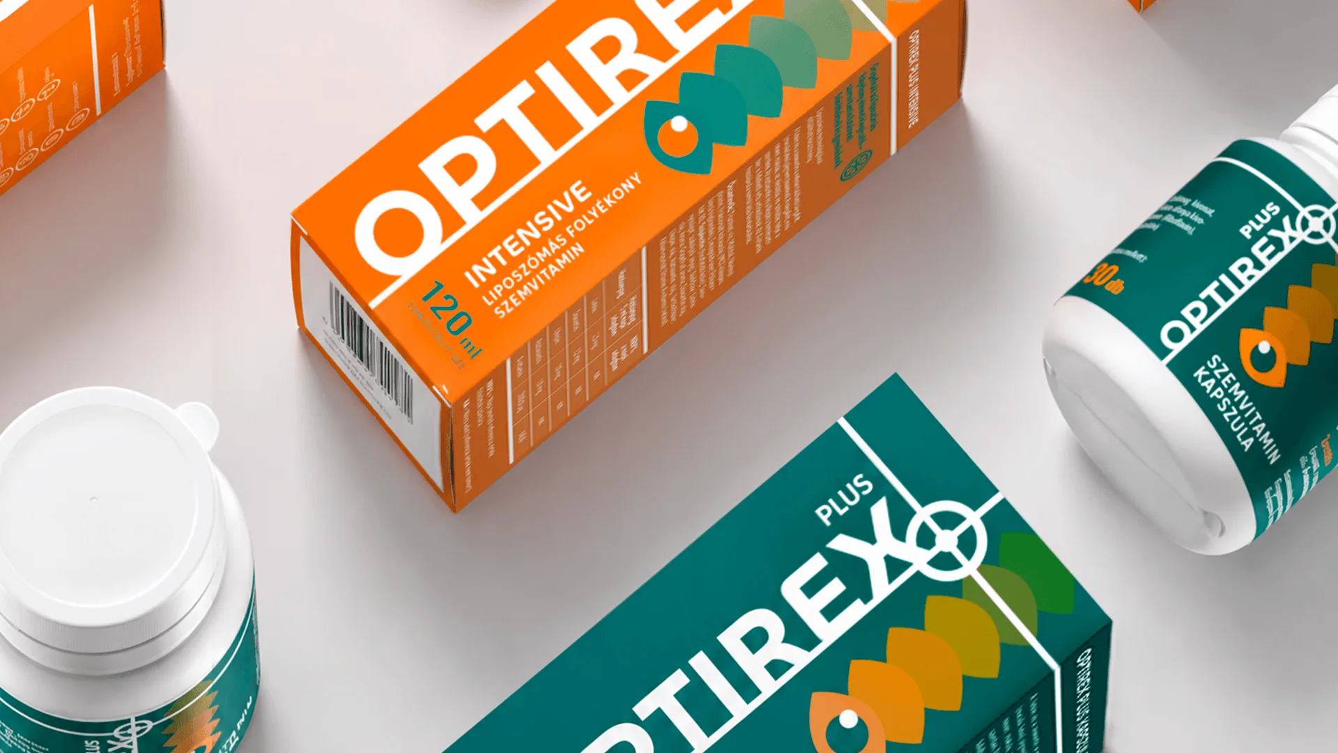
Optirex Plus eye vitamin packaging design – liquid and capsule product range with a consistent pharmacy visual identity
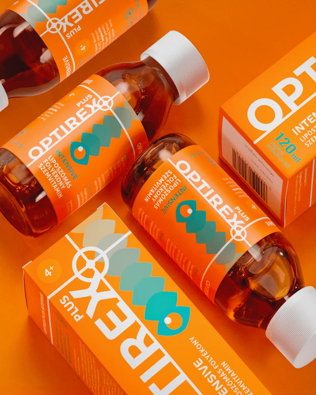
Optirex Plus eye vitamin packaging system – orange and teal product boxes and pharmacy formats
Get in touch

Thinking about a similar project? Let's get in touch.

Zoltán Kovács

Zoltán Kovács

Group Account Director

Related work

View all
Deutsche Telekom SHIFT employer branding event – speaker with event branding visuals in the background

We worked on the creative concept, brand identity, stand design and full-scale implementation of Deutsche Telekom’s international staff event, Telekom...

Telekom Shift
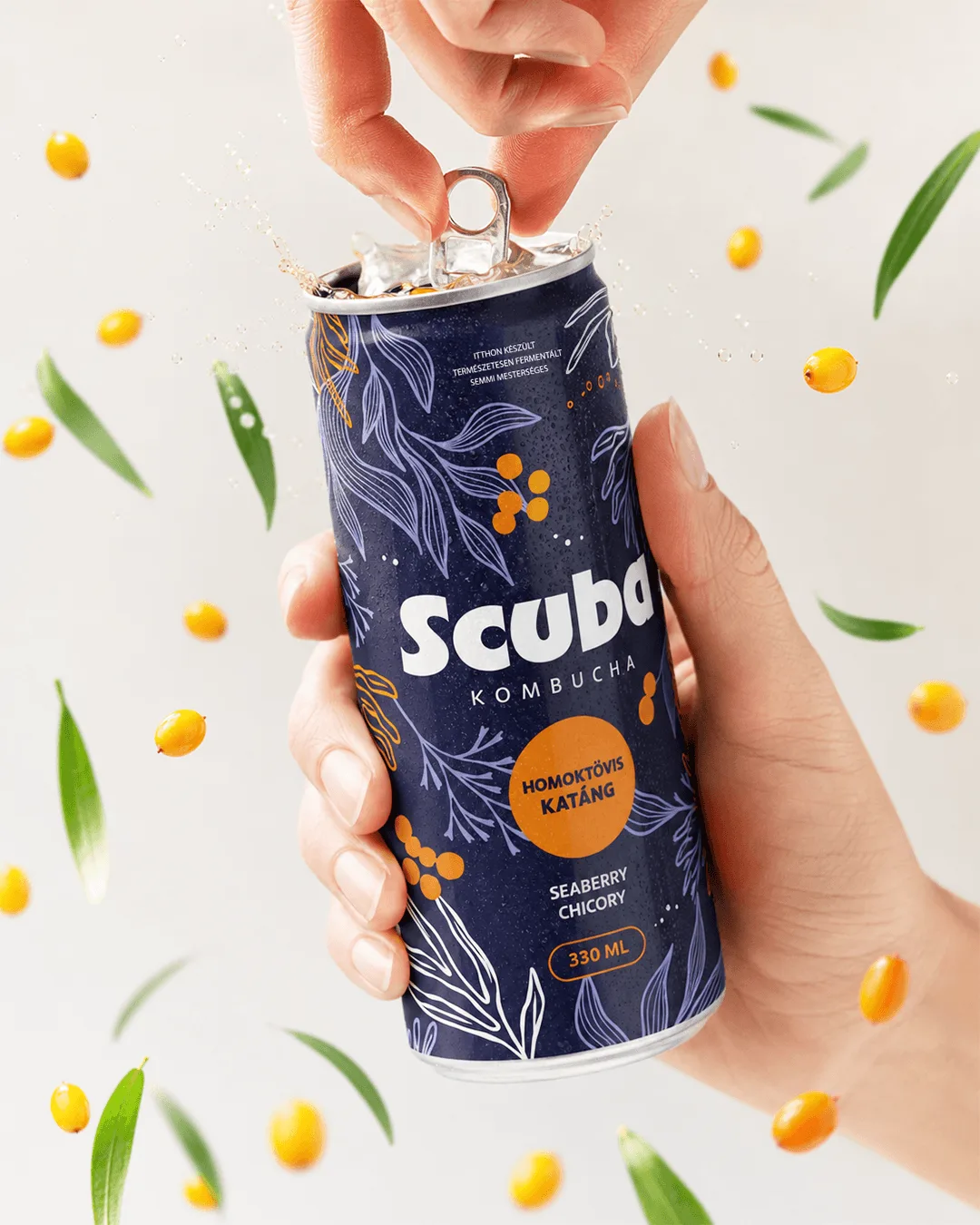
Scuba Kombucha packaging design – opened can held in hand among floating yellow fruits and green leaves

We designed the packaging for Scuba Kombucha, a premium kombucha range, for natu.farm. The brand launched with three flavours – sour cherry and cascar...

Scuba packaging design