Natu.farm
Scuba packaging design

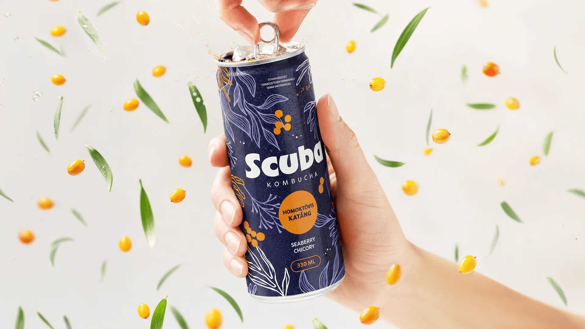
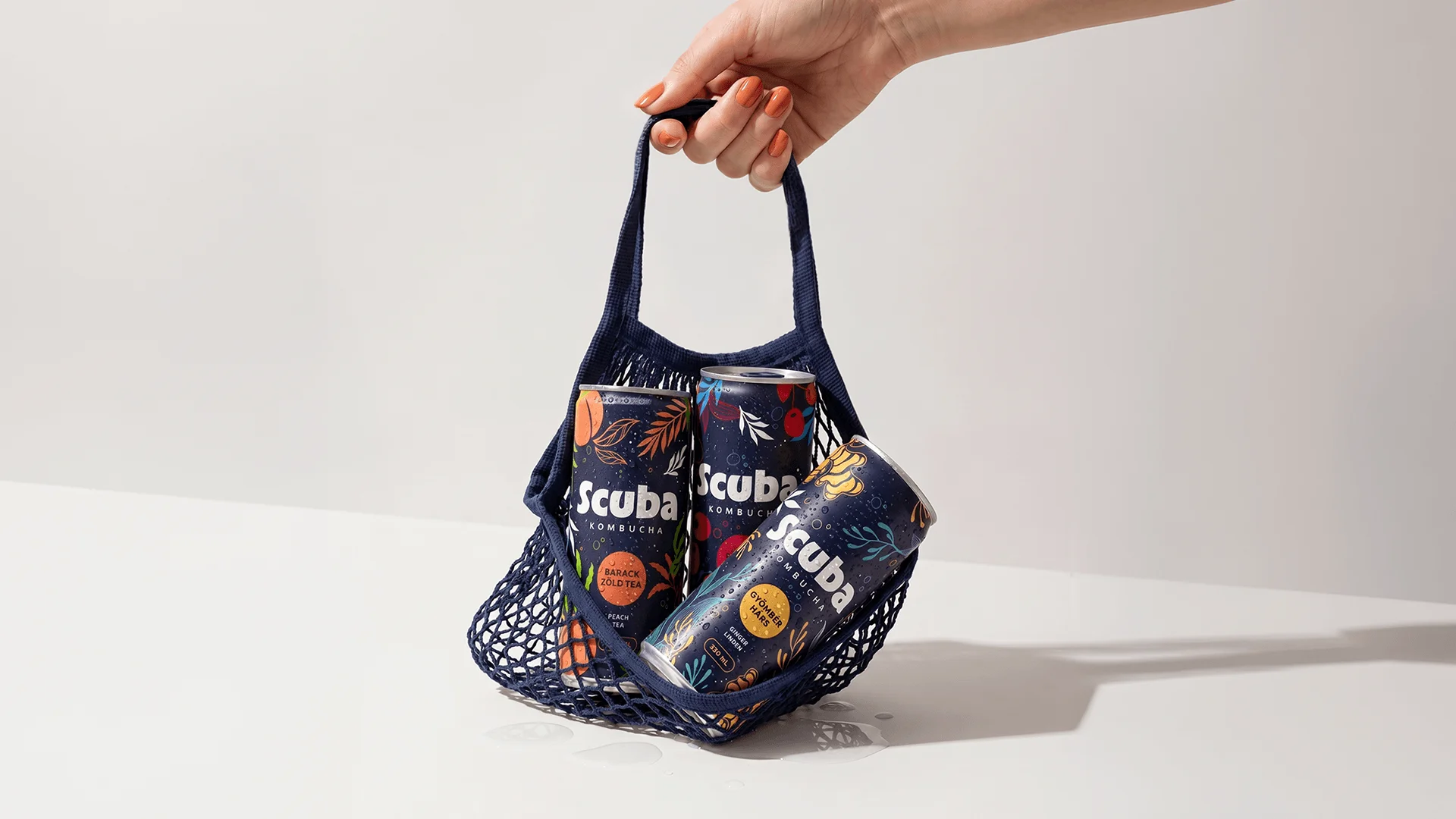
We designed the packaging for Scuba Kombucha, a premium kombucha range, for natu.farm. The brand launched with three flavours – sour cherry and cascara, ginger and lime blossom, and apricot and green tea – alongside its own website and a positioning tailored to premium, eco-conscious cafés.

The aim was to create a 0.33-litre aluminium can packaging design that breaks away from the herbal, artisanal visual style typical of the kombucha category, and builds a contemporary, distinctive, urban brand image for conscious consumers.

Services: Campaign, Branding, Content
Industry: FMCG and consumer goods
Client: Natu.farm
Scuba Kombucha alumíniumdobozos csomagolástervezés natu.farm számára

The challenge

The packaging for Scuba Kombucha needed to convey the product’s natural, sustainable ethos, its premium quality and its fresh, experience-driven character all at once. The challenge was to ensure that kombucha was presented on the shelves not merely as a health-conscious alternative, but as an exciting, contemporary drinking experience.

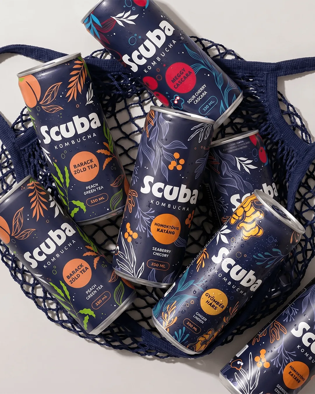
It was also important that the three flavours be instantly recognisable individually, whilst the entire product range functions as a unified brand system in retail, café and digital environments.
The approach

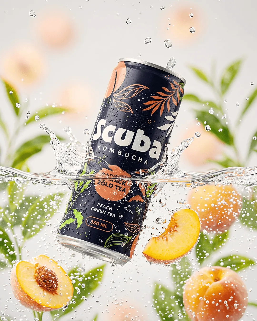
Drawing on the SCOBY-SCUBA association inherent in the brand name, we have created an underwater, bubbly yet minimalist visual universe. The clean-lined logo is complemented by a bubble motif, which simultaneously evokes the effervescent character of the fermented drink and the diving experience associated with the name Scuba.

The packaging features a unified design system: the black background, vibrant flavour colours, minimalist illustrations and the metallic surface of the aluminium can combine to create a strong, premium shelf presence. The contrast between the matt and metallic surfaces lends a premium feel, whilst the unique pattern conveys a fresh visual language.

The results

The final Scuba Kombucha packaging has created a distinctive, easily recognisable and tastefully understated brand identity. The design supports the brand’s positioning within the premium alternative drinks category, whilst conveying its sustainable ethos through a contemporary, social-media-friendly visual language.

The packaging serves as an eye-catching brand tool in retail, tourist and café settings, whilst the colour-coding assigned to the three flavours makes identifying the product range simple and memorable.

Scuba Kombucha prémium dobozos csomagolás víz alatti és lifestyle környezetben

SCOBY has become SCUBA: the world of fermented drinks has found its own identity in an underwater, bubbly yet minimalist packaging design.

Scuba Kombucha csomagolásdesign kézben tartott dobozzal és friss vizes vizuális világgal
Get in touch

We're always excited to hear from people who believe in what they're creating.

Szabó Orsolya

Szabó Orsolya

Business Unit Director, Partner

Related work

View all
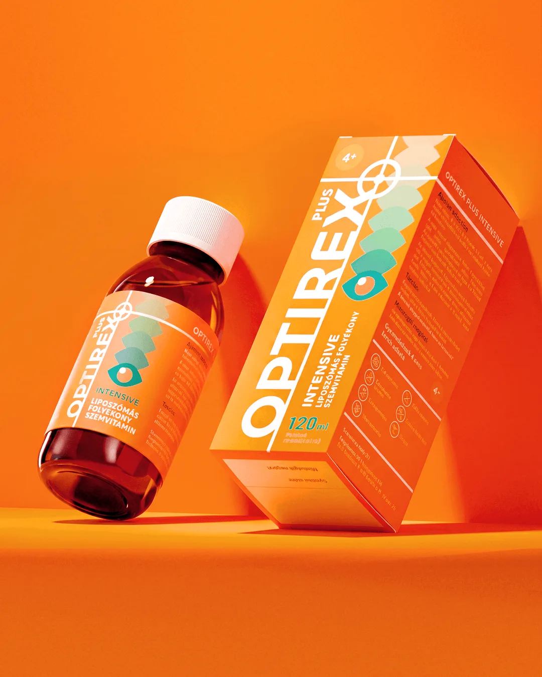
Optirex Plus szemvitamin csomagolástervezés modern narancssárga vizuális világban

We worked on revamping the packaging and visual identity of the Optirex Plus eye vitamin range for Penta Pharma. The aim was to create a modern, insta...

Optirex packaging design
Telekom SHIFT employer branding rendezvény event branding vizuális háttérrel

We worked on the creative concept, brand identity, stand design and full-scale implementation of Deutsche Telekom’s international staff event, Telekom...

Telekom Shift